I was the only designer at Moon Surgical. The Maestro robot’s touchscreen was causing surgeons to abandon procedures mid-surgery. I redesigned the entire interface. After launch: 0 surgery restarts.
View ImpactPreview of the robot’s second-generation human-machine interface
Maestro is a compact laparoscopic surgery robot. Before each procedure, the surgical team configures it through a touchscreen: procedure type, arm positions, camera mode, force settings. They do this in gloves, under bright OR lights, with a patient already on the table. There’s no room for confusion.
Close-up of Maestro Robot’s GUI in action during surgery
Find out why surgeries were being cancelled mid-procedure, fix the root cause, and build a design system that could scale across 40+ U.S. hospitals.
The same report kept coming in from ground support: surgeons were quitting on the robot mid-surgery and switching back to manual. I needed to understand why, so I ran three research tracks:
Surgeons, surgical assistants, and circulating nurses across multiple hospitals
Staff documented friction points and workarounds over 4 weeks of daily use
Live observation of surgical teams interacting with the GUI during real procedures
I grouped everything by severity. Three problems showed up in 85%+ of sessions and were the direct cause of cancellations:
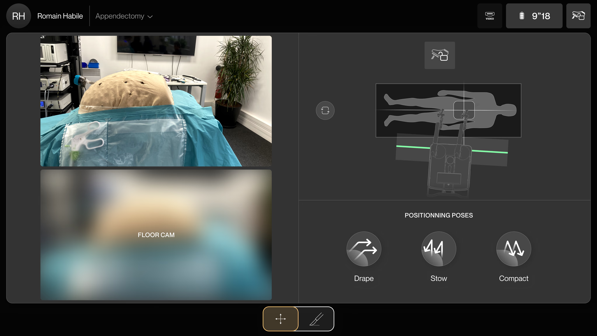
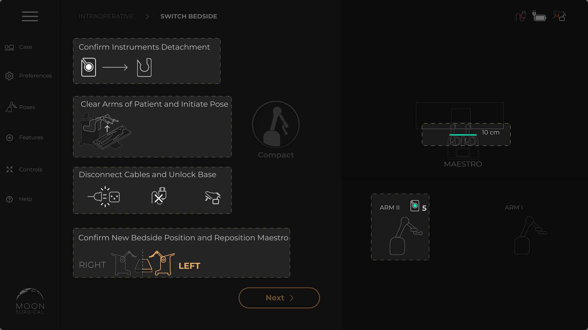
Setup should be three steps. But the screen was packed with buttons, sliders, and toggles that weren’t needed yet. People hesitated. They hit the wrong control. Cognitive fatigue in an OR is dangerous.
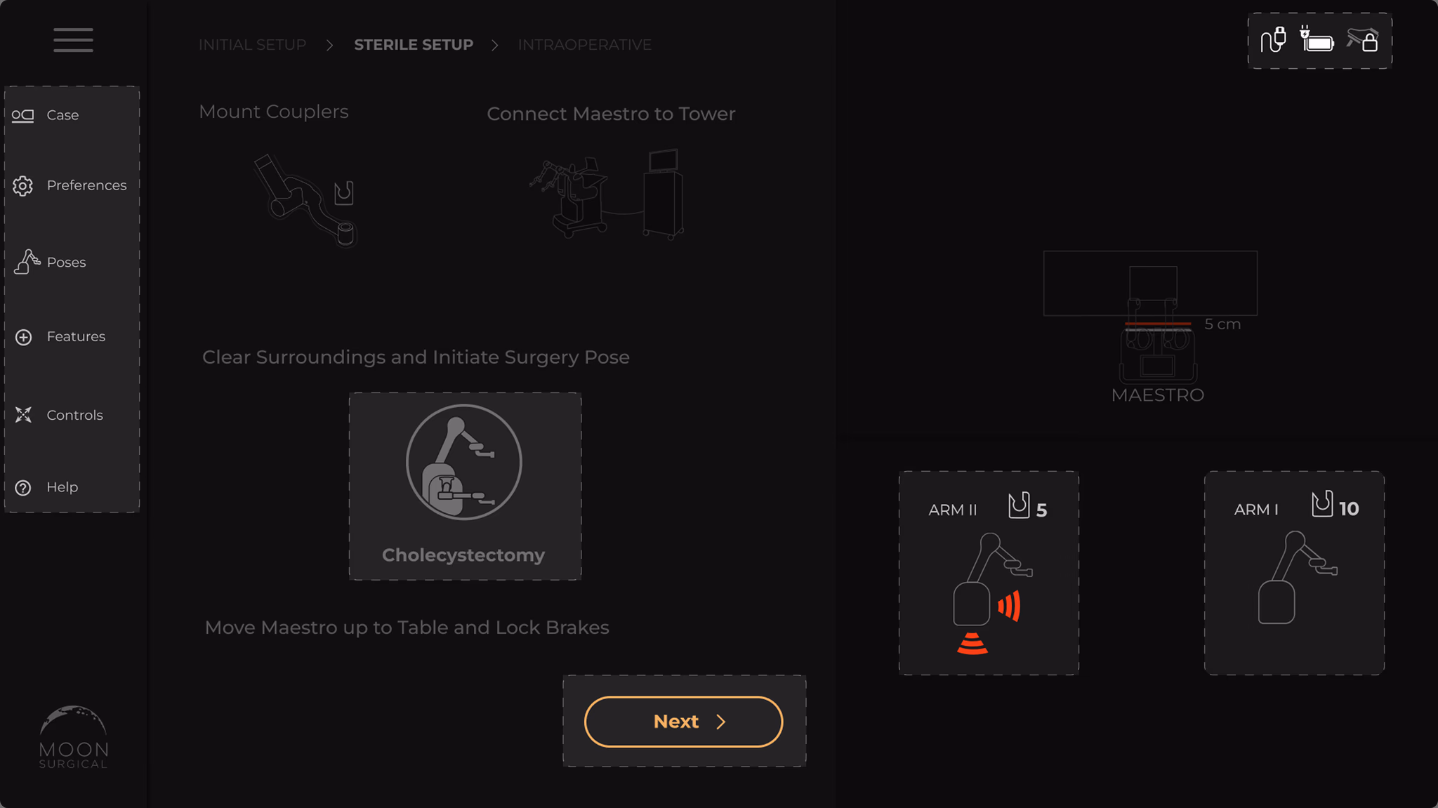
The instructions were walls of text. Nobody reads paragraphs while setting up a surgical robot. People didn’t know what to do next, backed up, tried again. Setup took twice as long as it should.
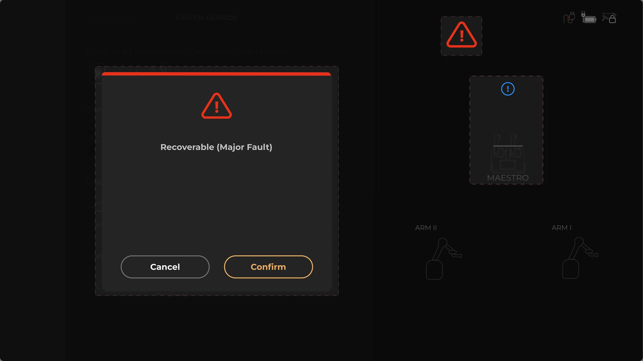
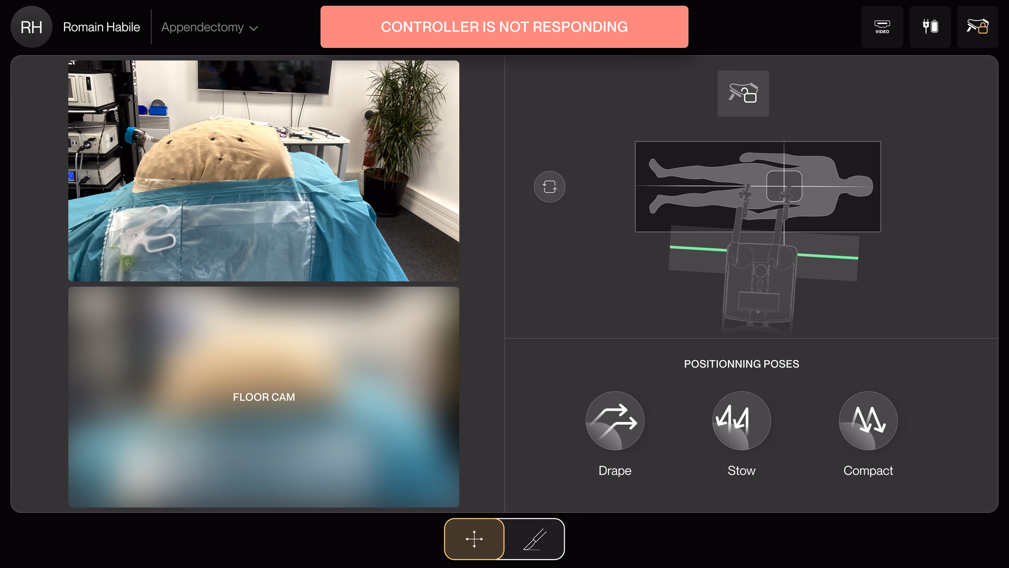
A fault occurs and a modal takes over the entire screen. No explanation. No recovery path. The only option: restart the whole system. With a patient on the table. That’s how you lose a surgeon’s trust for good.
We didn’t land on the final direction immediately. Three approaches failed first.
Adding more information didn’t work. Restricting the flow didn’t work. The answer was subtraction: strip out every non-essential element and make what remains instantly recognizable through icons and animation, not text.
The failed attempts made the principles obvious. Everything came back to three ideas:
Replace text-heavy controls with icon-based recognition to reduce reading time under pressure
Faults in high-stakes systems must be informative, non-blocking, and recoverable
Replace static instructions with immersive animations that guide through adjustments
I built the system using atomic design: tokens, then atoms, then components, then screens. The three principles aren’t guidelines someone can skip. They’re embedded in every component by construction.
Design system components built using atomic design methodology
Core tokens optimized for bright OR environments and gloved-hand interaction.
The OR forced every token decision. A misread screen means more time under anesthesia.
Each fix maps directly to one of the three problems. Because they all came from the same design system, they shipped as one cohesive update, not separate patches.
I pulled everything off the setup screen except what you actually need: positioning, locking, arm control. The rest went into advanced menus. Fewer choices, faster decisions.
Nobody reads paragraphs while prepping a surgical robot. I replaced the written instructions with short animations that show each adjustment as it should happen. The full details live in a reference manual, but most teams never need it.
Immersive animated instructions for arm adjustment
No more screen-blocking modals. When something goes wrong now, a label appears at the top telling you exactly what happened. You can still see and use every other control. The system keeps working while you fix the issue.
Three screens. That’s the whole flow. Prerequisites, Setup, Surgery. We mapped all 14 fault types and designed recovery for each. The animations are 2–3 seconds, timed to match actual arm movement speed. We tested slower and faster — too slow felt patronizing, too fast and the guidance was missed.
The complete linear user journey: Prerequisites → Setup → Surgery
For three months post-launch, we tracked setup duration, system restart frequency, and surgery completion rate with the robot across every deployment.
I was the only designer on this. Research, design system, screens, testing, handoff. The team brought clinical knowledge and business context.
This project reset how I think about pressure in design. Not shipping deadlines. The kind where someone is under anesthesia.
It depends on consequences. If tapping the wrong one extends someone’s time under anesthesia, three buttons feel impossible. I used to think cognitive load was about quantity. It’s about anxiety.
Surgeons didn’t abandon Maestro because the technology failed. They abandoned it because the screen made them feel like it might. I didn’t add features. I removed reasons to hesitate.
We found problems in the OR that never appeared in any design review or simulation. A clean screen in Figma becomes chaotic when you’re wearing nitrile gloves under surgical lights. I don’t trust lab testing anymore for products like this.
Don’t block the user. Show what went wrong. Let them recover without losing context. I designed this for a surgical robot, then realized it’s the same pattern AI products need: confidence signals, graceful degradation, and always an escape hatch for the human.